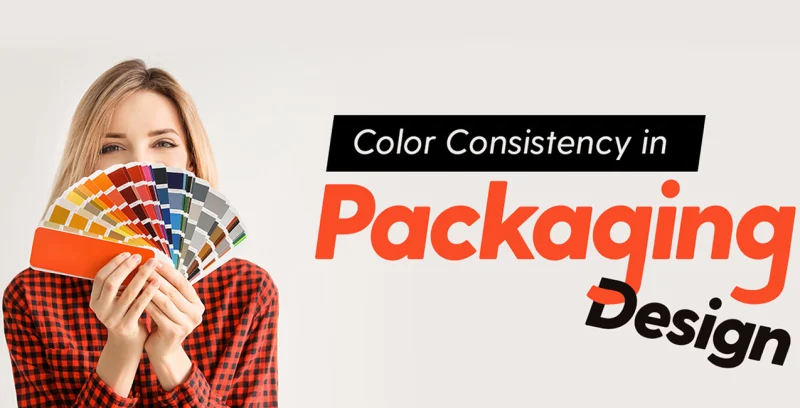
Introduction to Logo Color Psychology in Packaging
Have you ever found yourself captivated by a product on the shelf, irresistibly pulled in by its striking shades before even glancing at the details? In the realm of packaging, colours are far more than mere decoration—they act as a silent influencer, subtly steering your emotions and guiding your choices.
Logo colour psychology explores how particular tones can spark distinct feelings, forge strong brand identity, and ultimately shape consumer actions. For those navigating the packaging industry—be it buyers or managers—harnessing this delicate craft can transform a product from mundane to memorable. Let’s delve deeper into this vibrant enigma and uncover why it holds such significance for you.
Why Does Color Psychology Matter in Packaging?
Picture yourself strolling through a supermarket aisle, engulfed by a torrent of products vying for attention. What captures your eye first? More often than not, it’s a vibrant burst of colour. Research reveals that an astonishing 85% of consumers base their purchasing choices solely on colour, while up to 93% of buying decisions hinge on visual appearance.
This isn’t mere coincidence; it’s the psychological impact of colour at play, subtly influencing your mind before a single word or detail registre. A bold red can ignite a sense of urgency, whereas a calming blue envelops you in reassurance, often without conscious awareness.
For brands, the implications are monumental. Selecting an ill-fitting hue can distort your brand identity through colour, alienating potential customers before they even engage with your product. Packaging that fails to resonate emotionally risks being overlooked—or worse, conveying conflicting messages.
Imagine a premium product wrapped in a cheap, garish tone; it’s an immediate deterrent. Therefore, understanding the connection between consumer behaviour and colour is crucial for crafting designs that mesmerise at first sight. Struggling to align your brand with the right emotional tone? Here, colour psychology emerges as your ultimate ally, guiding you to captivate and convert with precision.
What Is Logo Color Psychology?
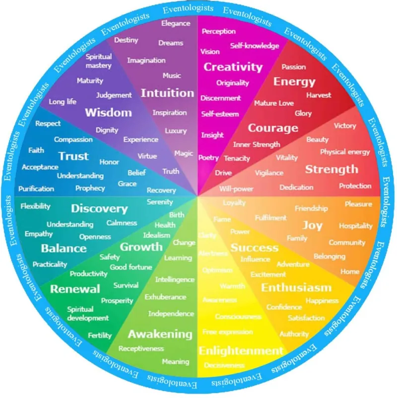
At its core, colour psychology in branding explores how various hues evoke emotions, influence moods, and guide choices. When integrated into logos and packaging, it involves selecting tones that reflect your brand’s essence and connect profoundly with your target audience. Imagine it as an unspoken dialogue—colours murmur your identity, much like a nostalgic melody awakens a forgotten feeling. A vibrant red radiates passion and daring, whereas a soothing green whispers tranquillity or nods to environmental harmony.
In packaging, your logo often acts as the initial introduction between brand and consumer. The importance of logo colour lies in its ability to communicate powerfully without words—shaping your values, your character, and the reasons to choose you over competitors.
Colours bear emotional and cultural weight, weaving the narrative around your product. Have you ever noticed why fast-food brands favour red and yellow? Indeed, it’s deliberate; these shades ignite appetite and a sense of urgency, a strategic push grounded in psychological insight.
However, there’s a pitfall: a poor choice can misfire. An ill-suited colour might undermine a premium allure or fail to elicit the emotional reaction to packaging you intended. Therefore, delving into this science is essential for anyone striving to master their brand packaging approach.
How Do Specific Colors Influence Buyer Decisions?
Colors wield quiet power, shaping colour influence on buyer decisions in ways that sneak under the radar. Let’s unpack a few standout shades and their effects in the packaging arena:
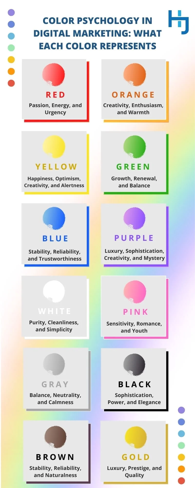
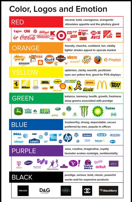
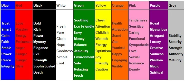
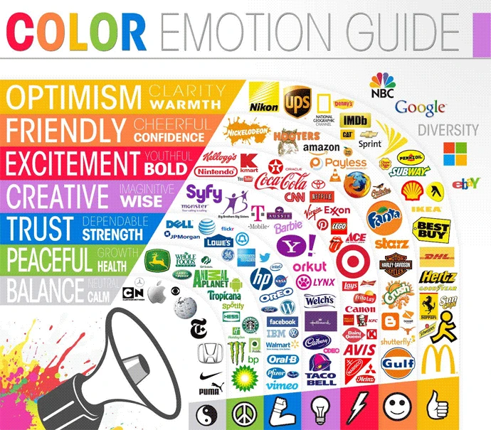
Red: Energy and Urgency
Red hits like a lightning bolt, impossible to ignore. Tied to passion, excitement, and even appetite, it’s a go-to for food brands. It screams “act now”—perfect for sales or limited releases. But tread lightly; in some cultures, overuse can signal alarm or aggression.
Blue: Trust and Reliability
Blue feels like a warm, reassuring nod. It’s the color of calm and dependability, often gracing tech or healthcare packaging. Like a dependable friend, it builds confidence. Yet, lean on it too hard, and your design might seem stale or emotionally distant.
Green: Nature and Wellness
Green breathes life, evoking health, nature, and eco-consciousness. It’s a natural fit for organic goods, painting images of lush meadows in a buyer’s mind. But overdo it, and it risks feeling uninspired to certain crowds.
Yellow: Optimism and Attention
Yellow bursts onto the scene like a sunny morning, radiating joy and grabbing focus. It suits playful, youthful brands but often whispers “budget” over “premium.” Used wisely, it highlights key details; overused, it can seem juvenile.
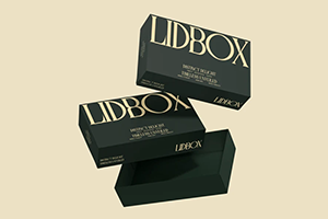
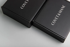
Black: Sophistication and Luxury
Black drapes your product in mystery and class, much like a tailored suit at a gala. It’s a staple for upscale brands, especially when paired with metallic accents for that exclusive edge. But for whimsical or lighthearted products, it can feel too somber.
A quick heads-up: these vibes aren’t one-size-fits-all. Cultural lenses can twist meanings—white might mean purity in one place, mourning in another. Knowing your audience’s pulse is crucial to nail the packaging design impact.
How Can You Apply Color Psychology to Your Packaging Strategy?
Harnessing color psychology in branding for packaging doesn’t demand a PhD—just a sharp game plan. Here’s how to build a standout brand packaging strategy step by step:
Step 1: Decode Your Audience
First, get inside your buyers’ heads. Are they trendy teens or seasoned pros? Price-sensitive or splurge-ready? Cultural roots shape color perceptions too. Bright, punchy shades might hook younger folks, while muted tones often soothe older demographics. Tune your palette to their heartbeat.
Step 2: Nail Your Brand’s Vibe
What’s your brand’s story? Edgy and daring, or steady and nurturing? Let your brand identity through colour reflect that essence. A wellness brand might embrace green for vitality, while a cutting-edge tech firm could lean on blue for innovation.
Step 3: Break Away from the Pack
Scout your competition—both on shelves and online. If everyone’s swimming in similar shades, dare to stand out. A bold, unexpected hue can ride the wave of packaging industry trends and etch your product into memory. Picture a shelf drowning in blues; a fiery orange amidst them steals the show, doesn’t it?
Step 4: Signal What’s Inside
Use color as a sneak peek of your product’s purpose. Green might hint at natural goodness, red at intense flavor or thrill. This quiet cue fuels the emotional response to packaging, guiding shoppers without overloading them with info.
Step 5: Test, Tweak, Repeat
Don’t just guess—validate. Run small tests or focus groups to see how your colors land. Tools like eye-tracking can pinpoint if your design pops off the shelf. Refine based on real feedback to make sure your hues hit the mark.
At C MIC Packaging, I’ve witnessed how personalized color picks can flip the script on packaging success. With a sharp eye on quality control and bespoke designs, we partner with brands to ensure every shade weaves the perfect story.
What Are the Hidden Pitfalls of Color Choices?
Beneath the alluring facade, choosing colours presents subtle yet formidable challenges. How can you ensure uniformity when dealing with diverse materials such as rigid boxes or corrugated boxes? Variations in printing methods and surface textures can distort hues—a striking red that pops on paper might fade into a muted shadow on cardboard if not handled with precision, ultimately weakening your brand’s distinct identity.
Furthermore, there’s the intricate challenge of global perception. Will your chosen palette resonate across cultures where interpretations differ? While red might signify prosperity in one region, it could evoke warnings in another. Ignoring these nuances risks hindering your brand’s international charm.
Additionally, sustainability plays a pivotal role; environmentally aware consumers often lean towards natural, earthy shades, and a mismatched palette might suggest your brand lags behind in eco-conscious values, an aspect where innovative approaches, like those from C MIC Packaging, shine brightly.
Finally, consider the future. Colour trends—such as the recent pastel obsession—can quickly render your design outdated. Does your colour scheme possess enduring appeal, or will it seem obsolete within a mere year? Navigating the delicate balance between fashionable and timeless is a challenge that often trips up many.
Conclusion: Turn Color Into Your Secret Weapon
Ultimately, logo color psychology in the packaging industry isn’t mere window dressing—it’s a calculated move to shape consumer behaviour and color connections. From igniting raw emotion to cementing brand identity through colour, the perfect shades can amplify your product’s charm and tip the scales at the moment of purchase. By knowing your crowd, weaving your brand’s tale, and testing your picks, you can wield the psychological effects of colour for game-changing impact.
Wondering how to paint this magic onto your own packaging? Whether you’re diving into packaging design impact or wrestling with colour influence on buyer decisions, a deliberate strategy can make you stand out. Drop a line to C MIC Packaging for custom solutions that fuse creativity with insight—let’s splash some color on your brand’s journey to success.