When Box Colors Go Wrong, Your Brand Takes the Hit
Imagine the excitement of a big product launch. You’ve spent weeks obsessing over every detail of your custom box design, and finally, the shipment lands at your doorstep. You rip open the package, only to feel your heart sink. The colors are a complete mess—not just a little off, but so wrong it’s almost comical. Except it’s not funny at all. It’s a disaster that could drag your brand’s reputation through the mud. Suddenly, your premium product looks like a dollar-store knockoff. Have you ever found yourself staring at a pile of botched boxes, wondering how it all went so sideways?
It’s not just about aesthetics. When your packaging colors miss the mark, it’s a punch to the gut for customer trust. People crave consistency, and when they don’t see it, you’re stuck dealing with returns, brutal online reviews, or worse—lost sales. Whether you’re a scrappy startup or a big-name retailer, a color flop sends a loud message: you cut corners. And don’t even get me started on the headache of reprint costs or delayed launches. It’s a mess that stings, and I bet you’ve felt that sting before.

Digging into the Mess: Why Color Errors Happen
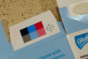
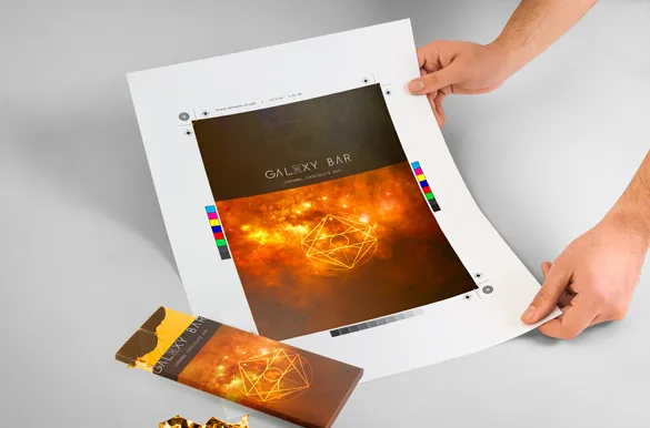
So, how do these infuriating mistakes even sneak in? Often, it kicks off right at the design stage. Maybe the file you handed over wasn’t clear enough, or the printer botched the specs. Sometimes, it’s as simple as skipping a thorough proof check before hitting “go” on production. Other times, the blame falls on outdated equipment at the supplier’s end, struggling to match colors precisely. And let’s be honest—rushed deadlines with no wiggle room for double-checking are usually the cherry on top of this chaotic sundae.
The result? A stack of boxes with shades that are nowhere near what you envisioned. These aren’t small oopsies; they’re costly disasters that better oversight could’ve dodged. If you’ve ever had to look your team—or worse, a client—in the eye and explain this mess, you know that sinking dread. But here’s the good news: you don’t have to keep rolling the dice with every order. There’s a way to outsmart this chaos with better packaging process improvements.

Stay One Step Ahead with Smart Design and Ironclad Checks
What if you could spot a color catastrophe before a single box even hits the press? Picture this: a system where you preview every tiny detail in real time and tweak mistakes on the spot. That’s the kind of magic a cutting-edge platform can bring to the table.
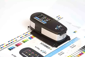
With AI-powered design tools, you can fiddle with colors instantly and ensure what you see on screen is exactly what you’ll get in print. No more holding your breath, praying that digital red doesn’t turn into some weird maroon. This can help prevent Pantone colour mismatches that damage your brand.
But it’s not just about nailing the design. Imagine having a clear view of every production step, with detailed quality reports at your fingertips. You’d catch hiccups before they snowball into a printing nightmare. Add to that a central hub for team communication, and you’ve just erased the risk of mixed-up instructions. It’s like having a safety net for your brand—every stage, from the first sketch to the final delivery, stays under your thumb. Can you already feel the weight lifting off your shoulders?

From Total Flop to Total Win: A Real-Life Comeback
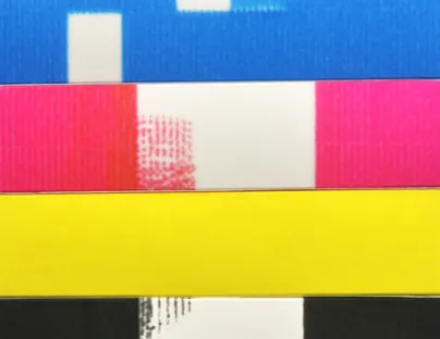
Let me tell you about a mid-sized cosmetics brand that was knee-deep in packaging disasters. Their iconic boxes kept showing up with missing colors, and their customers weren’t exactly quiet about it. The complaints hurt, bad. But then they pivoted to a streamlined platform with AI-driven design previews and real-time production tracking.
The result? Their first perfect batch in forever. They spotted a glaring color mismatch during a digital proof and fixed it without losing a beat. Now, their packaging screams their brand’s personality, and their customers can’t stop singing their praises.
This isn’t just a lucky break. Platforms built for precision and transparency can completely flip the script on how you handle custom box design. They tackle errors at the source, saving you time and a whole lot of stress. When you’ve got eyes on every step—from concept to final product—quality slip-ups become a thing of the past. Doesn’t that kind of seamless process sound like a dream come true?
Say Goodbye to Color Blunders for Good
Don’t let a botched box color or a missing shade derail your next big launch. With the right tools in your arsenal, you can dodge these pitfalls and keep your brand looking sharp. A platform like the one from C MIC Packaging offers real-time tracking, spot-on design accuracy, and smooth communication, wiping out mistakes once and for all. It’s about giving you peace of mind while delivering results you can be proud of.
Why keep stressing over packaging flops when the solution is just a click away? Take a second to check out how easy it can be to ace your next order. Explore this system and see the difference for yourself. Your brand deserves packaging that matches your vision—down to the tiniest detail, every single time. Ready to make color accuracy your superpower? If you have any questions or need assistance, don’t hesitate to reach out.
