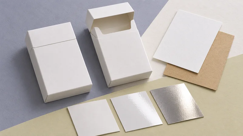
A small cannabis cigarette box brings a brand into the customer’s hand. The paper has a particular feel, the product information has a particular order, and the opening takes a particular movement. For cannabis cigarettes commonly sold as pre-rolls, these details shape the impression of the package as much as its graphics do.
Custom printing can make that encounter coherent: a recognizable identity, understandable contents and a presentation suited to the product. For brands serving lawful adult markets, this gives packaging a useful marketing role. The strongest results come from developing the artwork, structure and required information together.
Make the brand and the product easy to recognize
A compact box gives every element a demanding job. Within the space available for branding, the brand name establishes identity, the product name distinguishes the contents, and details such as pack count help someone understand what they are holding. Typography, spacing and contrast give those elements an order.
Consider a range with three-piece and ten-piece packs. A consistent brand mark and type style can make them recognizable as one family, while a plainly stated count keeps the difference clear. Color can reinforce that distinction, but a subtle change of shade asks too much of someone viewing the box under different lighting. The written information still needs to do its work.
This is where custom printing contributes more than decoration. It creates a repeatable visual language across sizes and versions. A distinctive arrangement of type or a well-proportioned brand mark can provide continuity even when the box dimensions change. That continuity makes a range easier to understand and gives the brand a stable physical identity.
Design around the information the finished pack must carry
The product’s legal category and intended sales jurisdiction belong in the design brief. They establish the basis for reviewing required wording, symbols, warning areas and permitted imagery, alongside any applicable requirements for opacity, child resistance or evidence of opening. A design approved for one product or destination should not be assumed suitable elsewhere.
These decisions affect the composition of the box. A front-panel warning changes the space available for a brand name. A variable-information label needs an appropriate surface and enough room for its contents. Placing these elements early allows the rest of the design to feel deliberate; adding them over finished artwork can obscure the very details intended to establish recognition.
At CMIC, we can work from the customer’s approved market-specific content to develop the panel layout and physical packaging. Reviewing a full-size layout with the required information included makes the choices tangible: which face introduces the product, where supporting details belong, and what remains visible after labels are applied. Regulatory approval of the content and packaging configuration remains a separate, product-specific decision.
Let the structure support the brand experience
The structure determines how much printable space exists and how the customer encounters it. A folding carton presents a different sequence of surfaces from a drawer box. A sleeve around a separate container introduces another layer. Choosing the structure before polishing the graphics helps the artwork follow the actual opening movement.
- Folding cartons: Printed paperboard folds into a compact box. This can suit a restrained presentation around an agreed inner pack or tray, with the fit and closure doing much of the practical work.
- Rigid boxes: A lid-and-base or drawer structure can give a multipack a more substantial feel and organize its contents. The additional material, assembly and shipping volume need to earn their place in the product’s positioning and budget.
- Paper sleeves: A sleeve can add a branded paper surface around an established primary container. Its dimensions and opening must preserve the required visibility, access and operation of the underlying pack.
For slender products, the relationship between the outer box and its contents is especially noticeable. An oversized cavity can allow an inner container to move and make the package feel poorly resolved. A tight arrangement can make removal awkward. A properly sized support or tray gives the contents a clear position and makes the opening feel intentional.
Where the project requires odor containment, moisture protection or child resistance, those properties need to be resolved in the complete packaging system with appropriate supporting evidence. Board thickness and an impressive exterior cannot establish them. Starting with the agreed inner container or closure lets us develop the paper component around the functions it needs to accommodate.
The commercial judgment follows from these relationships. A closely fitted folding carton can express care through proportion and ease of use. A rigid box may be appropriate when its presentation and organization add something meaningful. The useful question is what the structure contributes to this product and its handling, rather than how elaborate a box can become.
Choose paper, printing and finish as one design
The same artwork can make a different impression on different papers. A textured, uncoated surface can soften the appearance of fine detail and change how color reads. A smooth coated stock can support a crisper visual effect. Paper shade also becomes part of the palette wherever the design leaves the surface unprinted.
Finishing adds another layer of emphasis. A blind emboss—a raised mark without ink or foil—can give a simple brand mark a tactile presence. Foil can pick out a small detail. A matte surface can support a quieter appearance, although dark areas may make rubbing and handling marks more noticeable. Each choice needs to be judged on the actual material and in the places people will touch.
Restraint can help the hierarchy. If the brand mark, background pattern and product name all demand attention, the customer has to work harder to understand the front panel. Giving one element prominence and allowing the others to support it creates a clearer impression. The finish then has a specific purpose in the design.
Production details influence that impression too. A very fine border close to a cut edge can make small manufacturing variations conspicuous. A continuous pattern needs to be considered across folds and joins. We can assess these details against the proposed structure and print route, helping preserve the intended appearance in a manufacturable design.
Use samples to resolve the choices that matter
A useful early result is a package the customer can handle. Starting with product dimensions, pack count and any agreed inner container, CMIC can develop a structural proposal and a dieline: the flat drawing showing the box’s panels, cuts and folds. An unprinted structural sample can then reveal whether the proportions, access and fit make sense.
Apply the full-size artwork and the next set of questions becomes visible. Does the product name remain clear once the required information is present? Does a label wrap awkwardly around a corner? Does opening the box cover an important detail or damage a printed edge? These discoveries are easier to act on while the design is still being developed.
A printed and finished sample helps assess color, touch and surface behavior, with its production method understood. A digital mock-up or a sample made by a substitute process may show layout well while giving an incomplete picture of the final finish. For a dark matte carton, for example, the team needs to see how the proposed surface looks around the opening after normal handling, as well as how it looks untouched.
Recognition also depends on consistency between production runs. Paper, surface treatment and print process all affect the result, so an agreed physical reference is more useful for production comparison than a screen image alone. Keeping the approved artwork, material specification and sample reference aligned gives later orders a clear basis and helps prevent an unintended change from becoming a new version of the brand.
A useful marketing tool begins with a considered package
Custom-printed cannabis cigarette boxes earn their marketing role through a series of connected decisions. The identity is recognizable, the information is understandable, the structure suits the contents, and the physical finish supports the intended character. Together, those details give the customer a coherent impression of the brand.
If you are developing a paper packaging concept, talk with CMIC about the proposed pack. Product dimensions, pack count, intended market, any established inner packaging and a few visual references give us a useful starting point. We can assess suitable paper structures, printing and finishing routes, then develop samples that make the important choices easier to judge.