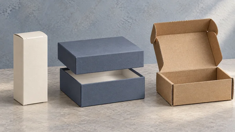
A colored shipping box can make an online order feel recognizably yours before the product appears. A field of terracotta, a compact logo or a pattern carried over from the product label can do that work. The box will also carry a shipping label and a closure, and it may show signs of handling. Its design has to make sense in that finished, working condition.
For a brand buying custom boxes, the useful question is which combination of appearance, information and opening experience will earn its added cost. At CMIC, we can develop the structure and printed design together, connecting the brand’s visual choices with product fit, packing and shipment.
Start with what the customer should recognize. An established brand color can connect the parcel to your website and retail packaging; a readable name confirms who sent it. For a newer brand, a distinctive color, clear typography and a consistent graphic treatment give successive orders a shared identity. Leave enough clear space around the main mark for it to register among the other things a working parcel carries.
Color also shapes the opening. A restrained exterior with a strong interior color creates a reveal, while broad exterior coverage makes the parcel expressive from first sight. For gifts or personal purchases where discretion matters, concentrating the branding inside may better suit the customer. The balance follows the product’s character and the circumstances in which it arrives.
Consider a skincare brand using soft green across its website and product labels. A green mailer can connect those elements, but a large logo centered on the lid may disappear beneath the delivery label. Placing the name on a panel that remains visible after packing, then carrying the green onto the inside lid, gives the identity another opportunity to register. A neatly supported jar completes that impression of care.
Brand information becomes more useful when each message has a place. The outside introduces the sender. The inside can welcome the customer or point them toward product guidance. Plan these surfaces on the assembled box, with the actual label and closure shown, so the artwork reflects what customers will receive.
| Location | Useful content | Detail to resolve |
|---|---|---|
| Visible exterior panel | Brand name, main color and a simple identifying graphic | Keep the main mark visible after labeling and sealing. |
| Shipping-label area | Delivery details and carrier barcode | Reserve a flat area that fits the label used in fulfillment. |
| Inside lid | A brief welcome or a pointer to product-care guidance | Check the reading direction as the customer opens the box. |
| Accessible interior panel | Support URL or a useful QR code | Make it easy to find before the packaging is discarded. |
A QR code earns its space when it leads somewhere useful, such as a setup guide or current support page. Add a short explanation and a readable web address, then try it at the intended size on the printed, folded box. Fold lines, ink spread and low contrast can make a code harder to read. Its destination should also remain useful for as long as customers may keep the packaging.
The paper beneath the ink changes the color you see. Brown kraft paper contributes a warm, darker background; white provides a lighter base. A bright yellow printed directly on brown kraft can look more muted than it does on white. A white printing surface is often a useful starting point for vivid colors, while visible kraft can be a deliberate part of a warmer, more understated design. Judge the combination alongside your product packaging, especially if both will be seen together.
The printing method affects appearance and price too. Ink may be printed directly onto corrugated board, the fluted board used for many shipping mailers, or onto a separate sheet that is then bonded to it. Fine lines, small lettering, photographic detail and broad solid areas place different demands on the process. We can compare suitable methods against your artwork and quantity, making their differences in appearance and cost easier to assess.
A screen proof helps establish layout. For color decisions, use a physical reference and establish how the sample was made. A folded prototype can demonstrate placement and opening, but its shade or finish may differ if it uses different materials or printing from the proposed production method. Agree the material, printing method, color reference and acceptable variation together. Those decisions give repeat orders a usable starting point.
The structure gives the printed design its practical foundation. Product dimensions, packed weight, fragility and the expected journey all influence the board, closure and internal support. A glass skincare jar needs suitable cushioning and restraint within its mailer; a rigid presentation box may need a protective shipping outer. A well-fitted pack also improves the opening: the product stays in its intended position instead of settling into an empty corner.
Surface choices deserve the same attention. Large dark panels can show pale scratches and edge wear. A coating or film can change the feel of the box and the way tape or labels adhere. Check proposed finishes on the actual material, particularly around folds, corners and closure areas. These are places where a pleasing flat print sample still needs to prove suitable for a working box.
A packed sample brings these decisions together. With the real product, insert, closure and shipping label in place, a packing trial can reveal a logo covered by tape, an insert that is slow to load or an opening tab that is hard to find. Those observations give us specific adjustments to make before final approval. For fragile products or demanding distribution routes, we can also coordinate suitable transport testing of the complete pack.
Judge the cost per packed order as well as the price of the empty box. Comparable quotations should identify dimensions, materials, construction, inserts, printing, finish and quantity, with delivery costs clearly defined. Packing time and storage matter too. A box that is cheaper to buy may require extra tape, take longer to assemble or occupy more warehouse space. For boxes made in China and sent to an overseas packing site, include the freight for the empty boxes in that comparison.
Check the parcel service before locking in the format. A flat-rate service may specify eligible dimensions or require designated carrier packaging. Confirm that a custom colored box qualifies before using that rate in your budget. Where charges depend on package size or weight, use the final packed dimensions and weight. Increasing the box size for visual effect can change shipping and storage costs even when the product stays the same.
Keep spending connected to the experience you want to create. A single strong color and a clearly placed brand name may serve regular replenishment orders beautifully. A gift order may justify a colored interior or a more elaborate opening. Removing an extra finish while retaining the defining color can preserve the identity and simplify the specification. Each additional detail should have a clear contribution to recognition, information, protection or the pleasure of opening.
At CMIC, we can bring these choices into a proposed structure, printing method and sample for review. The useful intermediate result is a design you can evaluate as a complete parcel, with the product, artwork, label and closure working together. Once approved, defined materials, a physical color reference and controlled artwork give future orders a clearer basis for consistency.
If you are considering colored shipping boxes, talk with us about your product and delivery plan. Share the artwork, color reference or product details you already have. We can help develop the remaining choices around how the delivery should look, how it will be packed and what it needs to withstand.