A small CBD balm carton sits beside hand creams and body lotions. Its proportions feel familiar, but a prominent leaf and an abstract promise of balance leave the product itself unclear. Give CBD body balm a readable place on the front, establish a recognizable brand identity and explain the contents clearly, and the same object becomes easier to consider in an ordinary shopping decision.
That is a useful contribution of CBD packaging and branding to bringing the category into the mainstream. Familiar design gives customers a starting point; clear information helps them evaluate the offer; the physical pack carries the brand into everyday use. CBD, short for cannabidiol, still needs to be identified plainly. The opportunity is to make an unfamiliar ingredient understandable within a recognizable product.
Give the product a familiar place
Retail categories have a visual language. A body-care product, facial serum and gift set create different expectations about application, presentation and price. A CBD brand can draw on those conventions so customers spend less effort identifying the product and more attention considering its particular qualities. The useful question is which familiar category most accurately describes what the customer is buying.
For a body balm, the product description and presentation should make its topical use clear. A dropper bottle needs equally careful wording: its shape alone may leave the intended use ambiguous. The front panel should establish the product type, while fuller use information remains easy to find when someone turns the pack over. This hierarchy also helps when only the front is visible in an online product image.
A cannabis-leaf motif can connect the design to the plant, but it is a broad cue shared by very different products. Giving it a supporting role leaves room for a more specific identity: whose product this is, what form it takes and which variant the customer is holding. Familiarity becomes useful when it leads to that level of recognition.
Give customers information they can examine
Someone comparing CBD products needs concrete points of comparison. Product form, contents quantity and formulation information should be easy to locate and consistent across the container, outer box and product page. A confident layout gives those details a clear order, with enough space to read them comfortably. It makes the brand’s care visible through the information itself.
A prominent CBD amount needs a clear basis: whether it describes the whole container or another defined quantity, for example. CBD content and hemp-extract content describe different things, so the artwork should preserve the verified formulation wording rather than treating those terms as interchangeable. A large number has limited value when customers cannot tell what it measures.
A QR code can provide access to more detailed information without crowding the carton. If it promises a batch test report, it should lead to a readable record covering the product and batch in the customer’s hand. A short explanation beside the code gives people a reason to scan it. The value comes from the connection to relevant information, rather than from the code’s appearance as a technical symbol.
The intended use and destination market affect product status, permitted claims and label content. Those points need product-specific review before final artwork. Resolving the content during packaging development also gives the design a realistic space requirement. At CMIC, we can work the confirmed copy into the paper-packaging layout while there is still room to adjust panel sizes and information hierarchy.
Build a recognizable brand character
Familiar category cues leave plenty of room for personality. Fine botanical illustration and warm paper tones might support an ingredient-led identity. Strong color, generous typography and a simple graphic device might create a more expressive presence. Either direction can be coherent. The choice should follow the brand’s position, its actual product and the experience it wants to create for its customers.
Visual associations deserve the same care as written claims. A cross, laboratory symbol or pharmaceutical-style layout can suggest medical authority. That suggestion needs to be considered against the product’s actual status and supporting evidence. A precise, orderly identity can also come from well-chosen type, balanced spacing and clear descriptions. Those details communicate attention without borrowing an endorsement the brand cannot substantiate.
Recognition across a range depends on repeating the right relationships. Keep the brand name, product description and variant information in dependable positions, then give each product enough distinction to be chosen accurately. If several concentrations are offered, color can help customers navigate, supported by explicit wording and quantities. That combination is especially useful when two cartons are seen separately rather than side by side.
Let the physical pack carry the same idea
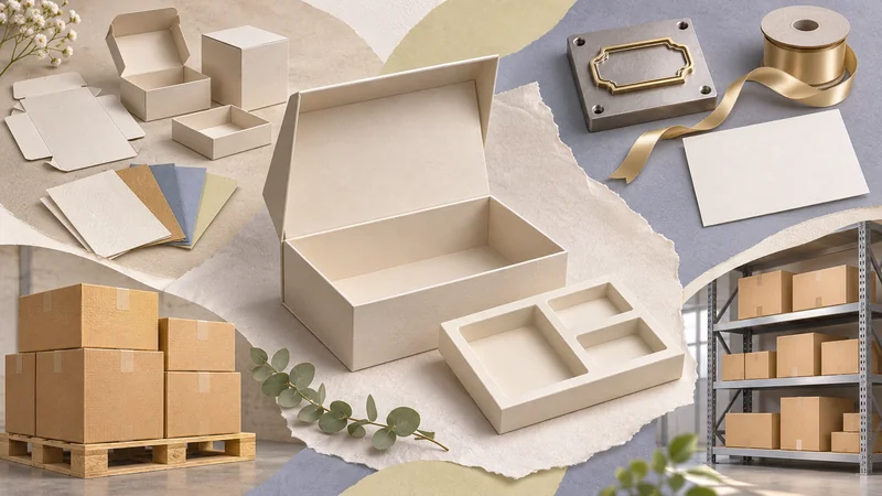
The structure changes how the brand feels in use. A rigid presentation box can give a multi-item gift set a deliberate opening sequence and keep its contents organized. A compact folding carton may better suit a single bottle intended for repeat purchase. Extra layers, magnets and inserts add material, volume and packing work; their contribution should be visible in the protection or experience they provide.
Small structural details have an immediate effect. The container needs appropriate clearance around its closure, and internal support can limit movement inside the box. The product should also be straightforward to remove. An insert that presents a bottle beautifully but makes it awkward to lift out creates friction at precisely the moment the brand is trying to establish ease and familiarity.
Surface choices influence both character and readability. A lightly tinted descriptor can lose contrast on warm, textured paper. Foil can catch the light beautifully while becoming harder to read from some angles. These effects can enrich a logo or decorative detail; essential product information benefits from a treatment that remains legible as the carton moves in someone’s hand.
At CMIC, we can develop and compare paper structures around the actual container and intended presentation. A structural sample helps reveal fit, access and opening movement; a printed sample helps assess color, small text and surface feel. Bringing those judgments together gives the brand a useful intermediate result: a physical pack that colleagues can handle and discuss before production details are finalized.
Carry the identity through every encounter
The carton has several jobs at different distances. On a shelf or in a small ecommerce image, the brand and product type need to register quickly. In the hand, finer information becomes available. Once the outer carton is removed, the bottle or jar continues the relationship. Planning these views together prevents an elaborate box from carrying all the identity while the container feels anonymous.
Color and typography should also be judged across the physical components. A label and a carton may use different surfaces, so approving them side by side gives a more useful picture of the finished product than reviewing each in isolation. The aim is a coherent family: customers should recognize the same brand in the product image, the delivered box and the container they keep.
That coherence needs attention when the range changes. A smaller carton can alter line breaks and make a previously clear description feel cramped. A revised quantity or market-specific text can affect more than one panel. Our project coordination can help keep the structure, artwork versions and sample decisions aligned, giving the customer a connected set of choices to review as the packaging develops.
Mainstream familiarity has an everyday dimension. The customer finds the right variant again, recognizes the jar after the carton is gone and encounters the same considered details on the next purchase. Packaging and branding can support that continuity by making the product clear at first glance and rewarding closer attention with information and an experience that hold together.
If you are developing a CBD range, talk with us about the packaging. The product format, intended market and visual direction give us a starting point for exploring paper structures, print choices and samples—turning an idea about the brand into something you can see, handle and evaluate.